CLIENT
Cisco
MY ROLE INVOLVED
UX Product Design
UI Design
Front-end Development
SUMMARY
I was hired as a consultant to understand client pain points and translate them into an all-new help portal for them to access technical software user guides.
PROBLEM STATEMENT
The Cisco Meeting Server (CMS) product documentation team had been hearing complaints from end-users that it was very hard for them to search for and obtain useful information from the various support guides/product manuals for the CMS product range. The docs team had come up with several stop-gap solutions over time but weren't able to get much traction with them because feedback from end-users was still poor.
I was hired to investigate what exactly the problem was by undertaking desk-research, interviewing internal stakeholders and also interviewing real-world users of the various CMS products. I was required to provide a solution to the problem and produce HTML/CSS/jQuery templates to handover to the back-end development team for production into a bespoke content management system.
PROJECT GOALS
- Identify client pain points and road-blocks to them achieving their goals
- Propose a docs portal solution which will encourage users to rely on it
- Incorporate slick animations and interactivity where relevant and possible
- Produce working HTML/CSS/jQuery template code for handover to dev team
RESEARCH METHODS
KEY FOCUS AREAS
- What is the competition doing well, which is causing a shift in customer expectation?
- Are we presenting content in such a way that makes it easy for users to find what they want?
- What motivates our website users to navigate the website and search for documentation?
KEY LEARNINGS
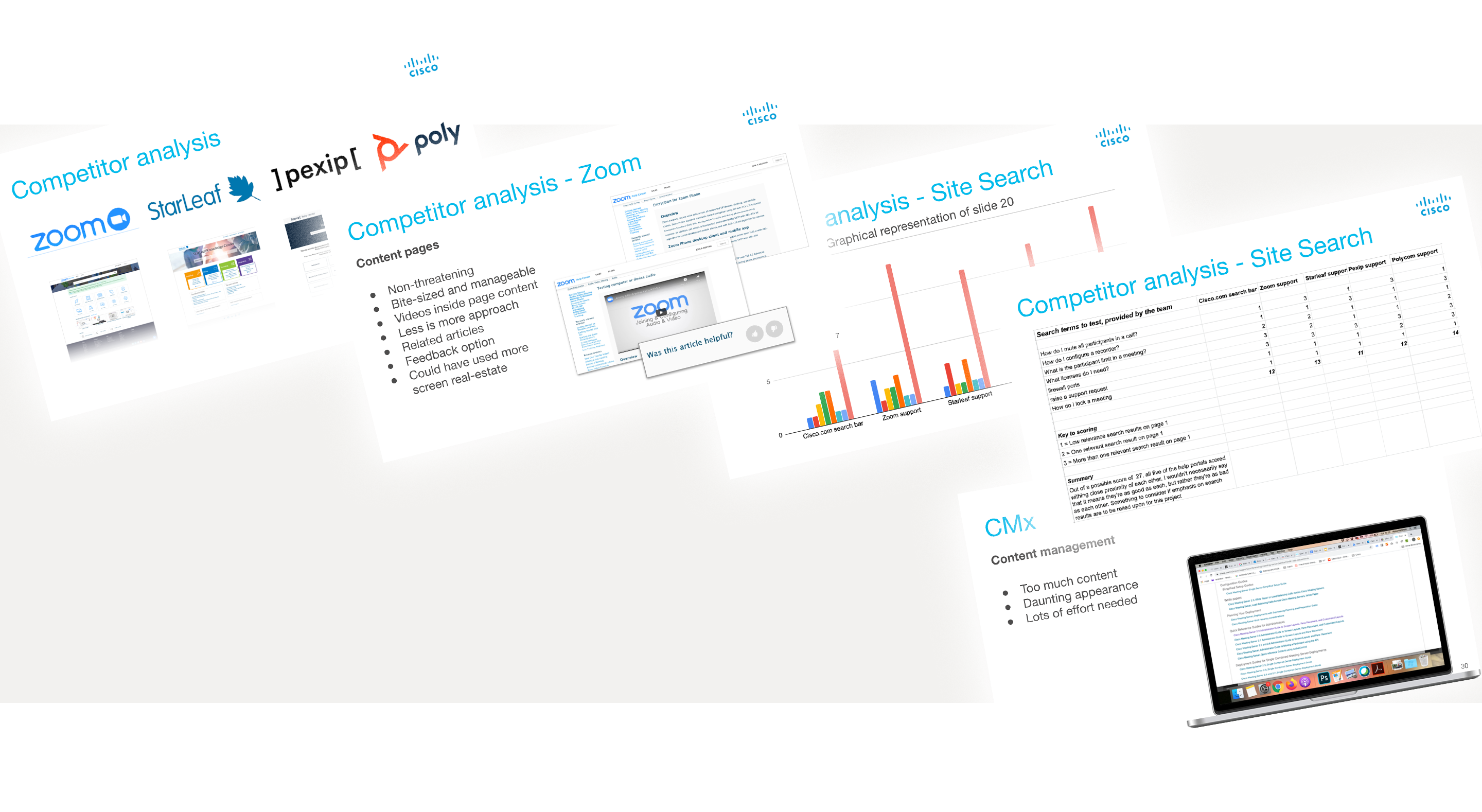
Concise and clean appearance
Competitor portals have a very clean appearance and don't give the impression to a user that they'll get lost in trying to find the information that they're looking for.
Compare this to the feel of the existing Cisco approach and the difference is clear to see.
Avoid reams of text links
Again, the clean appearance on competitor portals stems from their strategy to categorise topics nicely and prevent the navigation from being daunting. Users are already confused about the software which they're using at this point - a help portal should be a place of zen for them.
Improve site search facilities
Because the portals are dedicated unto themselves, search queries return relevant results. The Cisco help docs are on the main website, so when a user searches for help, they're often served marketing material, unrelated to their problem.
Humanisation and typography
Competitor portals leverage the human connection by either having video's with people explaining things, or just simple photo's to make it feel less daunting. Good typography has also been used to highlight titles and sections well, so that the hierarchy of information is intuitive.
CUSTOMER INTERVIEWS:
KEY TAKEAWAYS
Getting lost in software versions
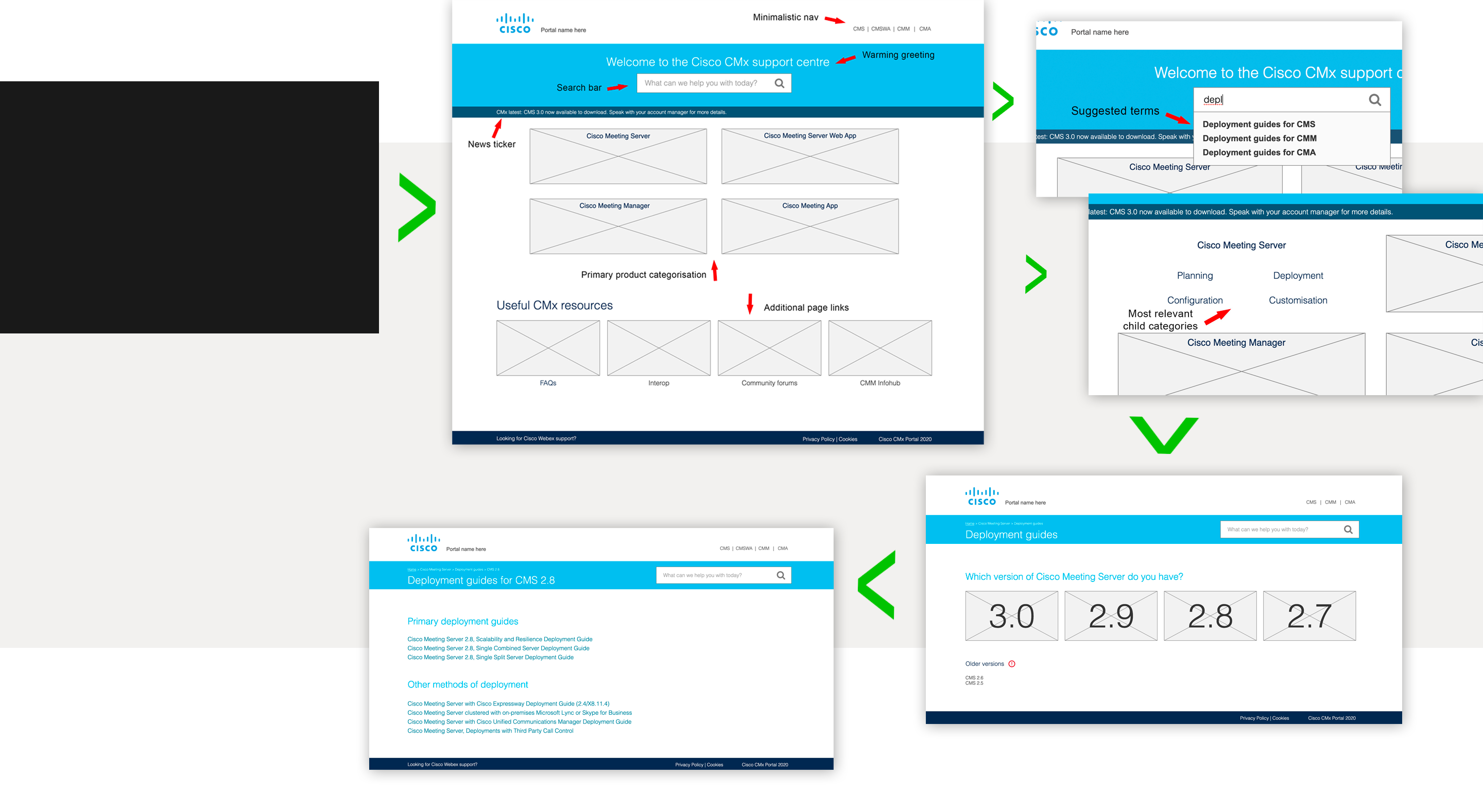
Each of the Cisco software solutions have several versions, which can often mean that just when a user thinks they've found the correct documentation to their problem, they realise that it's not for their specific version, which leads to frustration.
Avoid reams of text links
Again, the clean appearance on competitor portals stems from their strategy to categorise topics nicely and prevent the navigation from being daunting. Users are already confused about the software which they're using at this point - a help portal should be a place of zen for them.
HOW THE DESIGNS UNFOLDED
BESPOKE ANIMATED SVG ICONOGRAPHY (view the end prototype to see them come alive)
THE FINISHED PIECE
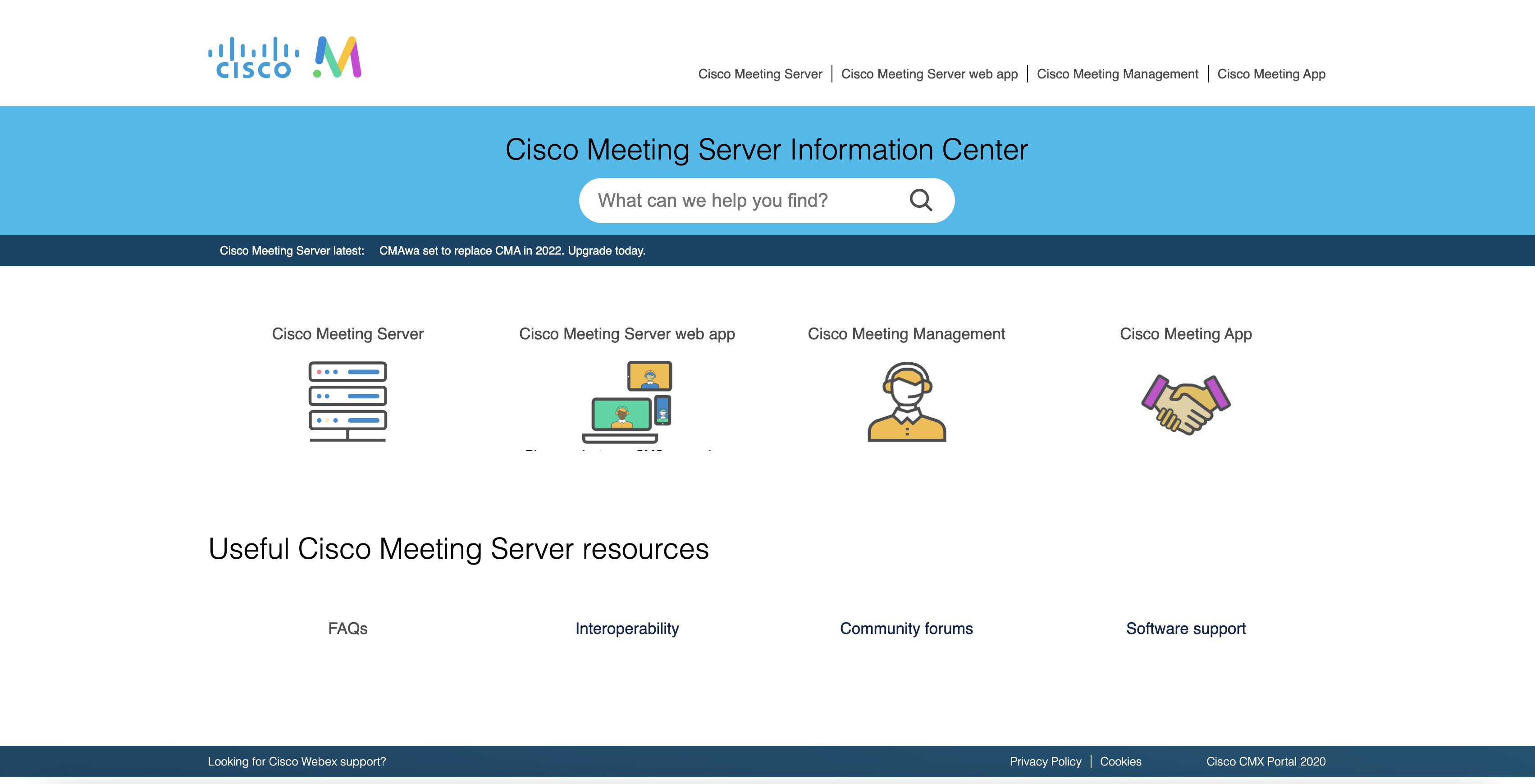
After some bouncing back and fourth with stakeholders, senior management and my sanity, the finished piece was largely formed from the second prototype as shown above, although it does contain some of the essence from all of them. Personally, I would have preferred to have retained the grey background on the hero image, but changing it to the red and blue gradient was sadly non-negotiable from the CEO. That being said, the overall result was very well received and exactly what we were looking for. Have a look at the video here to see the finished piece.
